Businesses know how important it is to have your website front and centre whenever their market searches for their services and products. There are a variety of offsite and onsite methods that each brand can apply in order to help their website rank higher on the search results page.
Below, we briefly list the best practices that make your website more visible to your market and generate more pest control leads. Moreover, we touch on the various website design elements that can help your pages keep readers on longer, lower bounce rates, and convert those pest control leads.
Lastly, will be showcasing the top Pest Control Websites that rank within the first page of search results in major cities and briefly discuss the different elements that have played an important role in bringing them up the ranks.
On-site SEO pertains to optimizing the content on both your web pages and blog pages, such as:
Off-site pest management, as the term implies, SEO applies to all of your off-site online marketing activities. These improve your brand's dependability and credibility, which has a good impact on Google's algorithm. Your off-site SEO can be improved by:
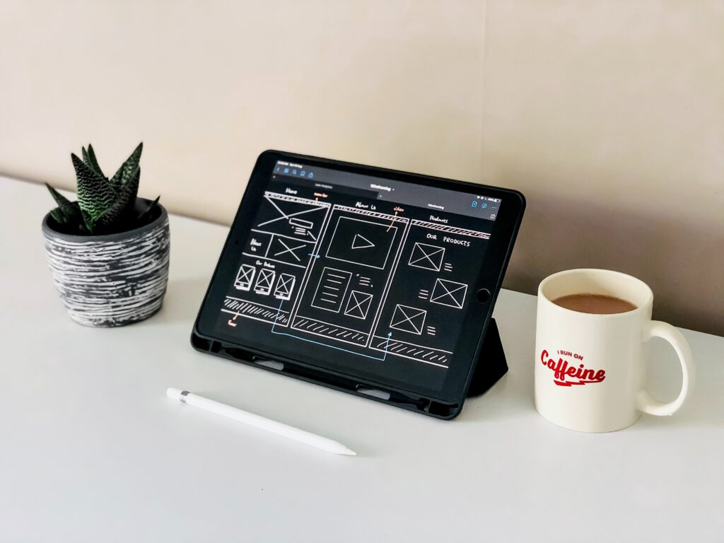
While it is important to actively build your website in such a way that makes it more visible, it is just as important to have it look presentable enough once your market lands on any of your pages.
By keeping our top 5 website design elements in mind, you can be well on your way to growing your loyal customer base, strengthening your leads, and eventually converting them. Moreover, websites that are designed properly not only help your readers get to where they need to go, but also give ample information so that your market can learn to trust you to fulfil their pest control needs.
#1 User experience
Consider how people could find, receive, and interact with the material you provide. Your chances of generating quality pest control leads increase as you give a higher-than-average user experience. Several elements that affect this include:
Shorter Load Time
Faster websites have lower bounce rates.
White Space
Your readers will have a much simpler time understanding and processing the information on your pest control website if there is enough white space to keep it clean, organized, and structured.
Easy Navigation
Your readers can reach where they want to go a lot easier if you have a straightforward navigational system.
Adaptive Design
Your pest control website design must be responsive enough to look well on any device, whether a mobile phone, tablet, laptop, smart TV, desktop, or other types of technology.
Contact Form
Clients may use it to get in touch with you, voice their issues, and learn more. It is also a method for you to gather data from them for pest control lead generation or marketing. Moreover, they can subscribe to newsletters this way.
Live Chat
Customers place a great value on accessibility and accommodating service, especially in the age of rapid gratification expectations. That is exactly what a live chat function can provide.
#2 Testimonials
Did you know that seeing recommendations from people who have used the product or service in the past increases the confidence of future customers about it by over 92%?
Gain more leads by fostering a sense of assurance, developing trust, and preserving the client-company connection!
#3 Call To Action
Call To Action (CTA) buttons direct your readers to the best course of action. It is preferable not to provide them too many alternatives (or none at all) when it comes to exploring your material in order to generate better pest control leads.
By gently guiding customers through the decision-making process with CTA buttons, you will make it much simpler for them to make a purchase and it will probably work out in your favor.
To make the most useful CT buttons, you should adhere to the following three best practices:
Make them distinctive
They perform best when they are plainly visible. Make sure your CTA buttons are big enough, placed with white space around them, and designed in vivid colours that stand out from the rest of your website to make them stand out.
Additionally, it is advisable to have them above the fold, or the area that readers can see as soon as they come on your website without having to scroll down.
Add some excitement
You don't have to settle with the typical "Click here" or "Download" buttons; instead, you may spice things up a bit and encourage your readers to proceed. "Download Your Free Pest Control Guide" and "Kick Start Your Pest Free Life, Book Now" are two amusing examples
Pick the appropriate shape.
Though it may seem like a minor consideration, choosing the proper form for your buttons may either make them more alluring or less so. You may experiment with several shapes to determine which ones your audience prefers.
#4 Visuals
A website with a wall of text from top to bottom is not something anybody wants to visit since it may be overwhelming and tiresome, which eventually results in a high bounce rate.
Visuals, similar to white space, aid in breaking up long passages of text and enhance page organization. The likelihood that readers will convert into quality leads increases if they find it easy to navigate your website. Here are some pointers for including images in the design of your pest control website:
Utilize real, high-quality pictures
Adding extra images to your pest control website design without incurring significant production costs is easy with stock photographs. However, it is preferable to choose photographs that give you a sense of being more real, human, and approachable.
It is best to include a few of your own photographs, such as those of your personnel, your headquarters, and your works, in addition to utilizing more "genuine" looking stock photos.
Create videos for topics harder to comprehend
Videos may significantly increase audience engagement and keep visitors on your web pages for longer. Another excellent use of a movie is to break down more complicated concepts that would take too much text to adequately convey. It may be used to highlight various products, ideas, and general company details.
Create infographics to show data
Your audience could find it intriguing if you highlight the findings of particular research, surveys, the efficiency of your services, or information on pest treatment. Infographics may be a creative and entertaining method to display these. After all, many people find that information provided in a visual manner is simpler to digest.
#5 Strong, educational, and captivating content
You should consider the weight and importance of each piece of material you choose to add to your website. If you want your readers to continue scrolling through the rest of your content, they must be worth their readers' time and attention.
Here are some essential guidelines to follow while writing your content in order to make sure that it is powerful, educational, and entertaining and provides value to each web page:
Get More Information: FREE URL OPENER TOOL FOR PEST CONTROL BUSINESSES
Strong SEO
Using SEO tactics to optimize your website can improve keyword targeting, website ranking, organization, and visibility.
Don't go overboard
Keep your writing concise, well-organized, and simple to read. These increase its interest and excitement.
Add a decent design to it
Displaying material well is a key strategy for increasing engagement with it. This applies to everything, including white space, paragraph organization, and font colours.
Pest Control Websites That Rank on Page 1
By religiously practising the various on-site and off-site SEO methods that each business can use to rank higher plus the crucial website design elements, you can soon find your way to the top of the search results page.
Below, we feature businesses that have already made it to the top of the list, and we cite the various reasons why they rank up there.
#1: Roberts Termite and Pest Control, Austin Texas
https://www.robertspestcontrol.com/
Factors that help it rank high:
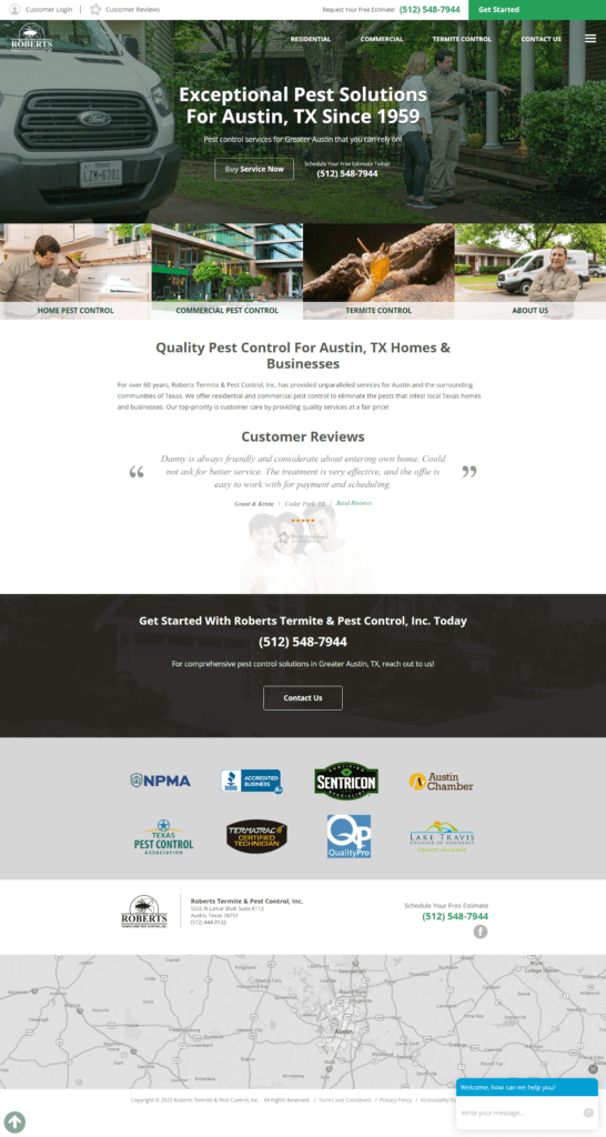
The Robert’s Termite and Pest Control website checks off a lot of design elements to make it a highly readable site.
For one, it has an excellent navigational menu to bring its readers to the various services they offer, as well as their about us and contact us pages. Next, they make it easy to reach them via the number on the top of the page, the Contact Us button in the middle of the page, and a Live Chat feature on the bottom. You can also find their location through the convenient map below.
Apart from their impressive use of white space and high-quality images, Robert’s Termite and Pest Control website also features reviews from their past customers to showcase their true first-hand experiences. They have paired this nicely with a list of logos from their previous or recurring clients.
Last, but definitely not the least, their website is neatly adorned with Call To Action buttons in each section, some of which point to their Free Estimate perk that each and every potential customer can enjoy.
#2: Western Exterminator, Los Angeles, California
https://www.westernexterminator.com/
Factors that help it rank high:
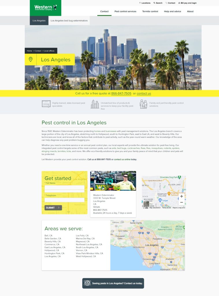
The Western Exterminator’s website is all about being approachable and reachable. On the upper part of the page, you are already greeted with their phone number, Contact Us button, contact form, Google Maps, and their full address. Moreover, they have conveniently listed all the areas that they serve so you know if your location is covered.
Apart from easy access to contact information, you will find an organized navigational system listing their services, about us, about termite control, and further advice.
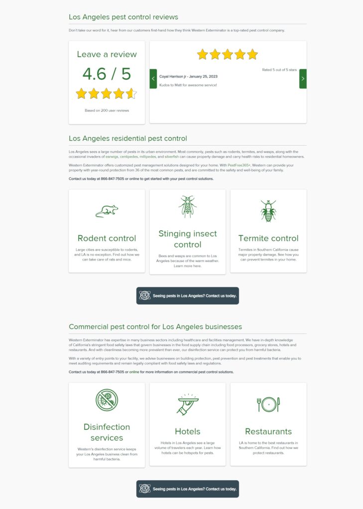
When you scroll down, you will find their customer reviews along with an overall ranking system. This is then followed by their list of services that either residents or businesses may frequently require. The use of white space and clean icons for visuals make their content very readable, easy to process, and clean to look at.
Must Read: WHERE TO GET PEST CONTROL SEO?
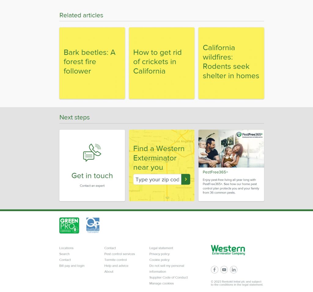
Lastly, at the bottom of the page, you can find a list of articles that may be relevant to your query, along with clear Call To Action buttons and a Live Chat feature.
#3: Hartz Pest Control, Houston, Texas
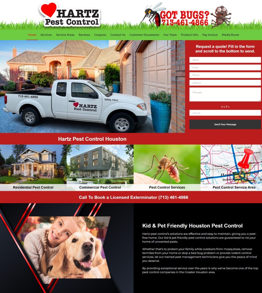
Factors that help it rank high:
On the upper part of the page, you can clearly see a contact form and their number, which helps clients reach out in just a few clicks. Apart from that, their menu is very thorough, citing multiple pages that readers may find useful. Just below are some of their frequently visited pages, paired with relevant, high-quality visuals.
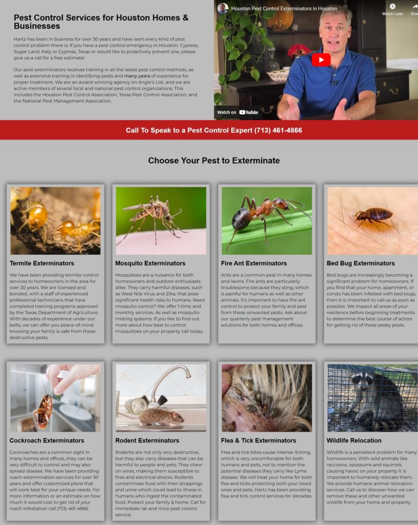
Scrolling further down leads their readers to an original YouTube video explaining why businesses and residents alike can make use of their pest control services. You may even find the most common types of pests that they can help eliminate with shorts descriptions below, and a handy Call To Action.
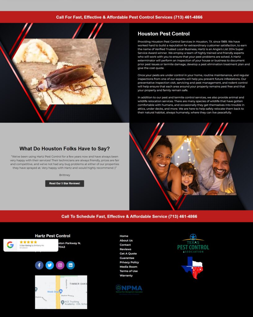
At the very bottom of their page, you may find a Call To Action button that will lead you to their review section, another Call To Action button that encourages users to schedule a service, and lastly, another navigational menu for easy access.
Perhaps the main element we feel it lacks is the Live Chat feature.
#4 Suburban Pest Control
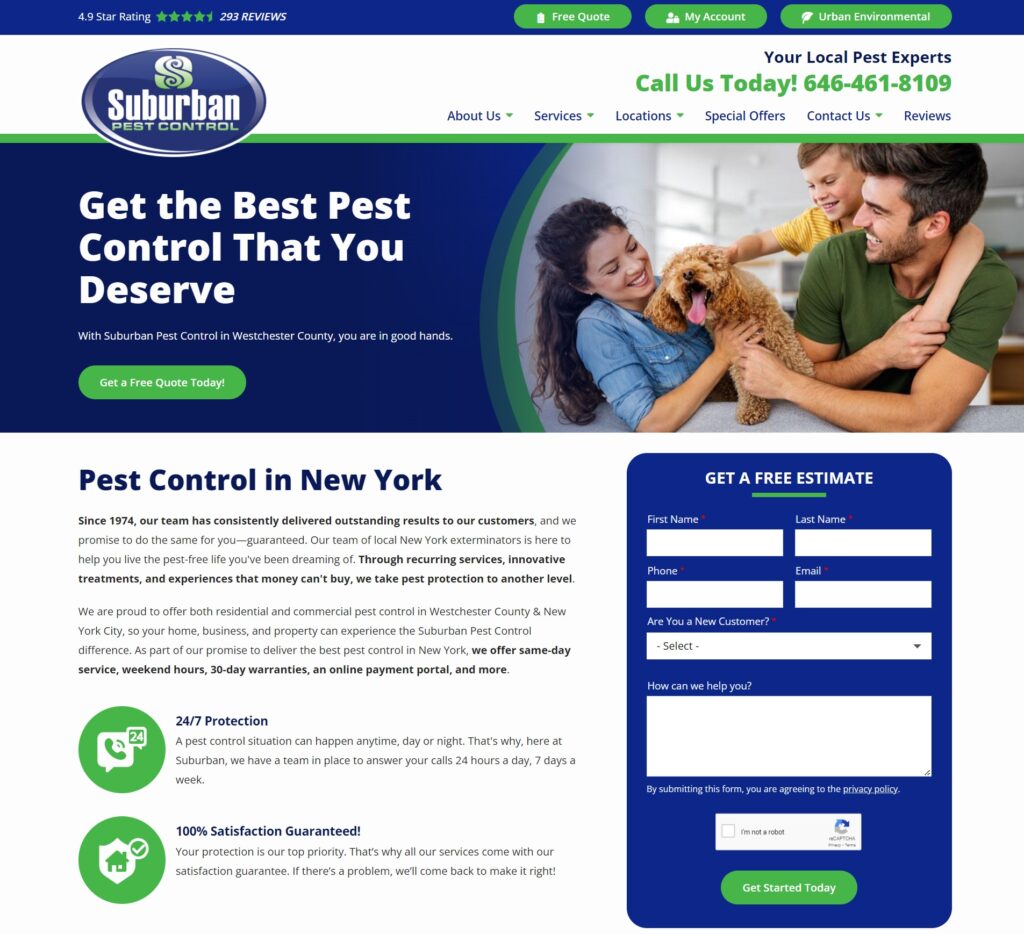
Factors that help it rank high:
Suburban Pest Control uses calm and complementary colours that are very pleasing to the eye. Moreover, their use of white space and quality photos help add good visuals to their overall site. On the upper part of the page, they greet you with a contact form for a free estimate as well as their phone number. You can also find a short description of their company and a Call To Action for a free quote.
On the header, their navigational menu is clean, concise, and offers relevant options.
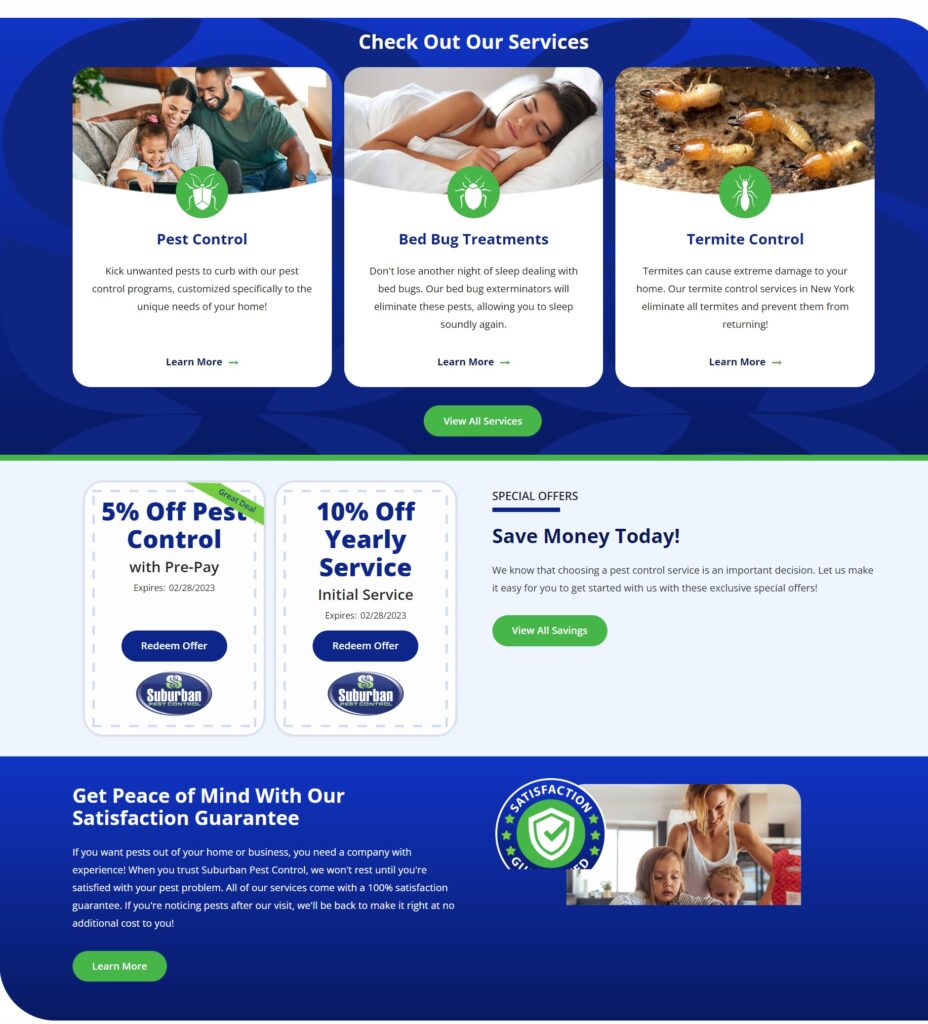
By scrolling down, you may find easy access to their main services, which is very convenient for those looking into specific treatments. They also offer their reader discounts as an incentive to schedule sessions with them.
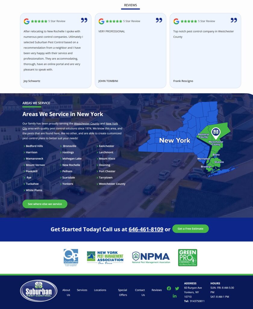
Lastly, you can find their reviews, a list of areas they service, and another call to action banner at the bottom of their page.
We feel that they also lack the Live Chat feature, but at the same time heavily invest in relevant content and visuals in order to provide their readers with a good website journey.

