If you want your business to grow and strengthen over time, you will need to stay on top of the digital progression as well. Gone are the days wherein all a client had to do was flip through the Yellow Pages and ring the first pest control service company they found along the list. Now, thanks to the internet, they not only get access to multiple companies with a few clicks of a button, but they can also learn a little more about each of them before committing to an appointment.
Moreover, all of this can now be done at the palm of their hands.
Mobile Is The New Desktop Computer
Did you know that over 90% of those who use the internet to find information and reach out to companies are either on their mobile phones or other portable devices?
Furthermore, a study way back in 2015 showed that over 60% of mobile device users were reportedly more likely to reach out to a local business if their site was responsive to mobile. That was over 7 years ago and it hasn’t slowed down since. Given these statistics, it is clear that it is much too big of a margin to not maximize and take advantage of.
While traditional computers and laptops are still widely used and definitely still worth taking into account, mobile is where the bulk of your potential clients are. Mobile is both the present and future of any business, which is why it is so important to offer a seamless pest control mobile experience when it comes to reaching you, learning about you, booking an appointment with you, and finally maintaining connection for proper after-sales and future bookings.
Mobile First Instead Of Mobile Friendly
Having a website that looks good on any screen, no matter the size is a surefire way to boost your lead generation and rankings on Google search. Even back when traditional desktops were the leading gadget and Google would still rank with the desktop version as the basis, marketers already made it a point to design their websites to be mobile-friendly. Meaning that the buttons, content, and everything in between would seamlessly adapt to other devices.
However, times have indeed progressed as Google started experimenting with mobile-first indexing in 2016. This means that the search engine started to assess the mobile versions of the sites when weighing out content to rank first on the results page. Prior to this update, Google was mainly only looking at the desktop version of the sites when ranking.
Because of this, many companies are now focusing on mobile-first design instead of just sticking with mobile-friendly. Mobile first design means to say that the foundation of their website was built specifically for the mobile phone. It focuses more on the attributes that make it work best on portable devices rather than desktops.
What Are The Four Levels of The Mobile Website Experience?

The mobile version of your website should look similar and have all the same content as your regular website, the only difference is that it has been tweaked and optimized to view in print.
However, in order to understand the best way you can provide an efficient mobile experience, you must first understand the three levels of mobile optimization.
Level 1: Mobile Friendly Site
A mobile-friendly site basically means that it is compatible with mobile phone users. It is essentially the regular version that is narrowed down to fit your screen of choice. Because its ultimate foundation is still designed for desktop use, it is not as user-friendly, functional, or has the exact design specifications compared to the regular website.
Moreover, it can sometimes display some flaws, such as when a user tries to select a button or item within the website, but the elements are spaced too close together due to the original font used within the site, they may end up accidentally clicking something else or not having anything load at all.
However, having a mobile-friendly website does already meet Google’s minimum requirements when ranking for a top spot in their search results pages. Despite this, it will still not rank as high compared to a mobile-optimized, mobile-responsive, or mobile-first site.
Level 2: Mobile Optimized Site
The next level is a mobile-optimized website. These have been specifically designed for much smaller screen sizes, such as today’s modern smartphones. Based on research, over 80% of eCommerce shoppers have shown a preference towards purchasing from a mobile-optimized website mainly because it is much easier and offers a smoother process.
When building a mobile-optimized website, you will first need either an IT or a digital marketing agency with ample experience in the topic. Moreover, it should meet the standard of Google’s algorithm, which includes:
Level 3: Mobile Responsive Site
The third level is a mobile responsive website. This is more precise than the first two kinds since it actually reformats and restructures its core design in order to properly fit any kind of mobile device with varying screen sizes. Its optimization efficiently communicates to the website whenever a mobile device is being used to accept it. The website then responds by tweaking its dimensions to be viewable and functional on the specific gadget.
Websites that are mobile responsive are highly versatile and will scale in order to meet the specific needs of even the largest-sized desktop down to the smallest-sized phone. This, by far, is the best way to offer a seamless pest control mobile experience.
Level 4: Mobile First Site
Last, but definitely not the least, a mobile-first site. The main difference between this and the first three is that having a mobile-friendly, optimized, or responsive site essentially means you started off with a desktop-focused structure. While having a mobile-first site means that from the very beginning, you intentionally built your website around mobile functions and around the concept of how most consumers interact with portable devices differently,
This by far offers the best pest control mobile experience for your potential clients since it has the most seamless navigation process of all four in terms of page redirects, menu design, button design, hyperlinked sections, and how condensed the content is.
What You Can Do To Provide A Better Pest Control Mobile Experience
Websites that deliver an efficient overall mobile experience are most likely to receive greater conversion rates, lower bounce rates, more sales, and an increased number of website traffic.
While the algorithms used to rank websites are constantly being updated, it is safe to assume that strength in mobile is the way they are heading. Mobile-friendly sites have shown to rank fairly well on search results pages as is, while mobile-optimized and responsive sites performed better, and mobile-first sites performed best.
There are three main ways to go about boosting your website’s mobile experience and reap its multiple advantages, namely:
Converting To A Mobile Optimized Website
If your website is not yet mobile-friendly, mobile-responsive, or mobile-optimized, then that is definitely where you should start off. However, this will not be an easy feat.
Converting your current website will take some time and expertise. This step is one that you will want to invest quality skill sets in since it needs to be well designed, properly coded, optimized for search engines, and contain a database-driven content management system (CMS). Depending on how far off your current website’s foundation is, you may need to either update your pages’ templates or start from scratch and perform a complete overhaul.
Whichever way you decide to go, we highly recommend reaching out to a professional website design company to ensure the process is done proficiently.
Design A Separate Site For Mobile
If you wish to keep your current website as is, you may design a separate site entirely dedicated to mobile instead. However, the downside to this is you and your company will have to maintain two sites instead of just one that would ideally be tailored to meet the needs of both mobile and desktop users. The latter is still the most recommended choice as it provides more efficiency and ease of maintenance.
Must Read: FREE URL OPENER TOOL FOR PEST CONTROL BUSINESSES
Build A New One
Lastly, you can also start from the beginning by having a mobile-first site designed and scrapping your desktop-centered site.
Essential Mobile Features To Consider
Since the shift to mobile, websites heavily vary in their level of responsiveness and functionality. However, there are five essential features you need to take into consideration no matter what kind of mobile site you are trying to build, namely:
#1 Fast Load Time
Studies show websites that load in 3 seconds or less enjoy the lowest bounce rates and higher conversion rates. Those that took longer ended up having their readers leave before the content even had the chance to display.
Because of this, you have to ensure you take the necessary steps to make your website as responsive and fast as possible. This means:
#2 Thumb Friendly Layout
One thing about mobile that you absolutely must factor in is that your readers will be utilizing their thumbs most of the time to navigate your website, not everyone wants to whip out a stylus every chance they get.
This means having to provide enough space between clickable elements and making the buttons big enough to easily choose.
#3 Live Chat
No matter the kind of website, a means to reach out to you directly should always be included in the design. For mobile sites, contact forms would be too tedious to fill up on a smaller screen which makes live chat a great way to keep your readers connected and provide better customer satisfaction should they have any inquiries and concerns.
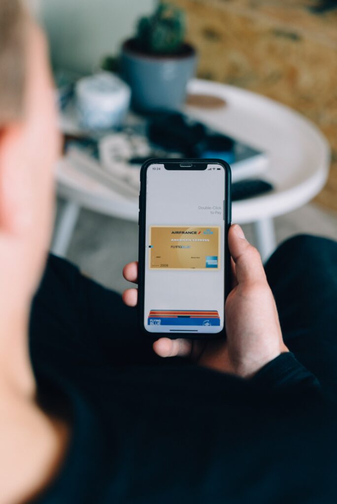
#4 Mobile Payments
PayPal, Amazon, Google Pay, and the like are essential mobile-friendly payments to include.
#5 Visuals
Especially when viewing content on smaller screens, no one wants to see paragraph after paragraph of text. Be sure that you incorporate a lot of engaging visuals to help keep your readers interested in your content and make your information easier to process.
Gary is awesome, we’ve worked with so many companies but never got the personal attention and care like we did him and his team.
Thanks Gary for your wonderful work. It’s not first time I hired him for a digital marketing campaign. On my 2nd SEO campaign with him for my second pest control business, Gary has again showed he can deliver on what he promises. Would recommend!

I highly recommend Pest Control SEOs for anyone looking for good results. Gary took the time to review my website and give suggestions without a guarantee we will even sign with them, he just wanted to genuinely help it looked like and that’s what drew me to working with his team.